The Psychology of Color in Brand Design: Choosing the Right Colors for Your Business
Color plays a big role in how people see your brand. The colors you choose can create emotions, influence decisions, and even build trust. Understanding the psychology of color can help you pick the right palette for your business. Let’s break it down.
Why Color Matters in Branding
Color isn’t just about aesthetics; it’s about communication. Different colors trigger different feelings and associations. The right color can make someone feel calm, excited, or confident. The wrong color can create confusion or even push customers away.
Think about the big brands you know. Coca-Cola is red, Facebook is blue, and McDonald’s is yellow. These colors aren’t random. They were chosen to evoke specific emotions and align with each brand’s identity.
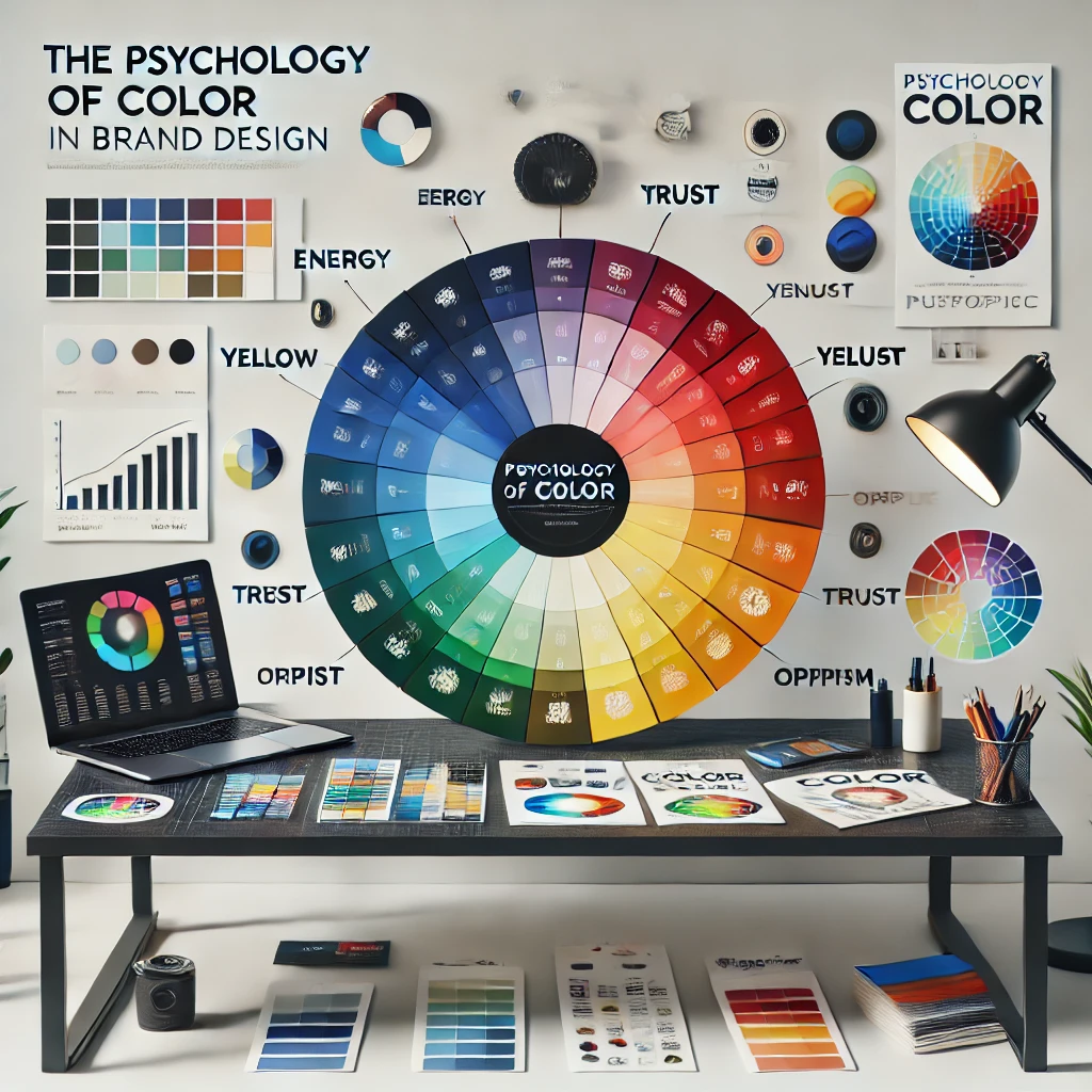
The Psychology of Common Colors
Here’s a quick look at what some colors typically represent:
- Red: Energy, passion, urgency. Red grabs attention and creates excitement. That’s why it’s often used in sales or fast-food branding.
- Blue: Trust, stability, calmness. Blue is a favorite for industries like finance and technology because it feels dependable.
- Yellow: Optimism, warmth, happiness. Yellow is great for creating a cheerful and approachable vibe.
- Green: Growth, health, balance. Green is often linked to nature, sustainability, and wellness.
- Black: Sophistication, power, elegance. Black works well for luxury brands and minimalist designs.
- White: Simplicity, purity, clarity. White space helps brands look clean and modern.
- Orange: Creativity, enthusiasm, affordability. Orange feels friendly and energetic, often appealing to younger audiences.
- Purple: Royalty, wisdom, imagination. Purple adds a touch of mystery or exclusivity to a brand.
How to Choose Colors for Your Brand
Start with Your Brand’s Personality
Think about how you want your brand to feel. Is it playful or professional? Bold or understated? Your brand’s personality should guide your color choices.
For example:
- A playful children’s toy company might use bright, primary colors.
- A high-end jewelry brand might lean on black, white, and gold for a luxurious feel.
Consider Your Audience
Who are you trying to reach? Different colors appeal to different demographics. Younger audiences might like bright, bold colors. Older audiences might prefer muted, classic tones. Cultural differences also matter. In some cultures, red symbolizes luck, while in others it might represent danger.
Look at the Competition
Check out what your competitors are doing. You don’t want to blend in. If everyone in your industry uses blue, consider a different color that still aligns with your brand’s identity.
Test Your Colors
Colors can look different on a screen versus in print. They can also feel different when paired with other colors. Always test your palette in different contexts before finalizing it.
Building a Cohesive Color Palette
Choose a Dominant Color
Your dominant color is the one most associated with your brand. It should reflect your brand’s core values and make a strong impression. Think of it as the anchor for your palette.
Pick Supporting Colors
Supporting colors add variety and depth. They should complement your dominant color without overpowering it. For example, if your dominant color is blue, you might choose white and gray as supporting colors for a clean look.
Use Neutral Colors
Neutral colors like black, white, and gray help balance your palette. They provide contrast and make your main colors stand out.
Limit Your Palette
Too many colors can feel chaotic. Stick to three to five main colors to keep things simple and cohesive.
Using Color Across Your Brand
Once you’ve chosen your colors, use them consistently. This includes:
- Logo: Your logo should feature your dominant color prominently.
- Website: Use your palette for buttons, headers, and backgrounds.
- Marketing Materials: From business cards to social media posts, keep your colors consistent.
- Packaging: If you sell physical products, your packaging should align with your brand colors.
Consistency helps people recognize your brand, no matter where they encounter it.
Avoiding Common Mistakes
Ignoring Accessibility
Make sure your colors are easy to read and accessible to everyone. For example, text on a background should have enough contrast to be legible. Tools like contrast checkers can help you test this.
Overcomplicating Your Palette
Too many colors can confuse your audience. Stick to a simple palette that’s easy to remember.
Following Trends Blindly
Trends come and go. What’s popular today might look outdated tomorrow. Focus on timeless colors that align with your brand instead of chasing fads.
Real-World Examples
Starbucks
Starbucks uses green to symbolize growth, freshness, and sustainability. It’s a perfect match for a brand focused on coffee and community.
Nike
Nike’s black-and-white palette keeps the focus on their products. It’s sleek, modern, and versatile.
McDonald’s
McDonald’s uses red and yellow to create a sense of urgency and happiness. These colors make people feel excited and hungry.
Bringing It All Together
Choosing the right colors for your brand takes thought and intention. Start by understanding your brand’s personality and audience. Build a cohesive palette and use it consistently. Avoid common mistakes like overcomplicating your colors or ignoring accessibility. When done right, your colors can become a powerful part of your brand’s identity.